HOA Budgeting - Extracting clarity from a PDF
Do you live in an HOA and get a once-per-year pdf with the breakdown of where your dues were allocated? If yes, then this post is for you! Instead of trying (and failing) to understand what on earth the figures in a poorly structured table mean - let’s build a dashboard in Tableau.
Here’s the Dashboard - embedded up front so you can get right into the digging:
Keep reading to see how this was built.
If you know anyone who could benefit from a personalized dashboard like this (for their HOA or something else) - reach out at:
hello@morescode-analytics.com
Introduction
My HOA dues keep going up. Sound familiar? Wondering why? Me too.
Once a year, residents are mailed a physical and pdf of their HOA’s Actual/Projected/Budgeted dollars for prior, current, and future years. Having lived in three different HOAs accross parts of the US (Midwest and Mountain West) I have seen a few version of these mailers. They mostly all look like multiple pages (mine has been 5-10 pages) of this:
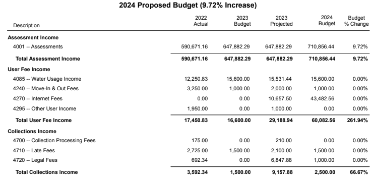
A pdf table nobody wants to read - potentially convoluted on purpose.
What you do pay attention to though is the accompanying notification that your dues are going up 9.72%.
So, like any good and slightly annoyed data guy - I’ve spent some time trying to understand where the money is going.
Cleaning
Data Entry. Nobody’s favorite finger jam (piano is better).
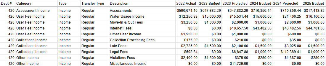
Step 1. Transcribe the pdf to a google sheet
Yep. I entered it manually. I could have used a pdf reader tool, or OCR / AI - but also there’s no better way to look at every number than to have to type them all out yourself.
To minimize mistakes, I kept the format similar to the original PDF for easy scanning and double checking - the major addition is parsing out text into categories, descriptions, and types (expense or income? regular or transfer?). As more budgets are shared every year, just one column needs to be added. Here’s a preview of that data entry sheet:
Step 2. Uploading a table to Google BigQuery
The data entry was easy in google sheets - but the type of pivot operation needed to make this tableau friendly is not. Basically we need each column to be copied into a set of rows for each category/description - this is called an “unpivot” and is much easier to do in SQL.
GBQ is a SQL database. If you only process <30gb per month, there are no costs. The size of this table is a few KB - so there’s no risk at all. Plus, a tip if you’re worried about getting a bill, don’t give them your credit card. They won’t let you run anything that exceeds the monthly max if you don’t give them your credit card. Problem solved.
You’ll need a project and a dataset (these are practically unlimited, just think of them like fancy folders), at which point you can upload from google sheets using BigQuery’s User Interface.
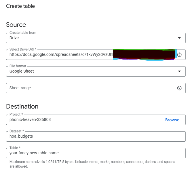
Really important and not shown: check “autodetect schema”, and “header rows to skip” = 1.
Now here’s the very cool part. When you do it this way, any changes you make in the google sheet are near time reflected in the database. Awesome. This works really really well for single file spreadsheets - like if you’re just getting started and have all of the information you need in one table.
Step 3. Transforming your data using SQL
We’re going to write a query and save it as a view. This means when we request information from the “view” the database is queried again and any new data is passed through the same logic. If you’re following along this is the second synced part of this pipeline.
Here’s the boilerplate query:
SELECT
  Dept_Name,
  Category,
  Type,
  Description,
  SAFE_CAST(SPLIT(col, '_')[OFFSET(1)] AS STRING) AS year,
  CASE
    WHEN ENDS_WITH(col, 'Actual') THEN 'Actual'
    WHEN ENDS_WITH(col, 'Projected') THEN 'Projected'
    WHEN ENDS_WITH(col, 'Budget') THEN 'Budgeted'
    ELSE 'Unknown'
  END AS classification,
  transactions
FROM (
  SELECT *
  FROM `phonic-heaven-335803.hoa_budgets.ntv_summary`
  WHERE Transfer_Type = "Regular"
)
UNPIVOT (
  transactions FOR col IN (
    _2022_Actual,
    _2023_Projected,
    _2024_Projected,
    _2025_Budget
  )
)
The key part to understand of what we’re doing is the UNPIVOT.
UNPIVOT (
  transactions FOR col IN (
    _2022_Actual,
    _2023_Projected,
    _2024_Projected,
    _2025_Budget
  )
This is creating two new columns called col and transactions, then for each col the values in the original column name (ex _2022_Actual) are placed in the transactions column - keeping the category, type, and descriptions all together. Unpivot essentially does this:
Starting Table:
| category | _2024_Projected |
|---|---|
| Assessments | 710856.44 |
Unpivoted Table:
| category | transactions | col |
|---|---|---|
| Assessments | 710856.44 | _2024_Projected |
From there, the information we need about year and type (actual/projected/budget) are in the col and can be parsed out as needed.
Step 4. Connecting from GBQ to Tableau
Two parts here:
- A connected google sheet
- Linking to Tableau
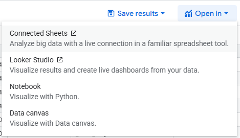
To create a connected sheet you have two options - from new google sheet or from the GBQ console. Google makes this real easy for you by including an “Open In” button in the lower right corner right after you run your query.
Once in the connected sheet you’ll get a preview of what you created and then create an extract. The extract is required because Tableau doesn’t recognize the connected sheet tab as a spreadsheet. If you had a paid Tableau licence you could connect directly to GBQ with you OAuth credentials instead of all of this.
![]()
We want the connected sheet instead of a CSV (another export option) because this is the third synced part of the pipeline - you can refresh the connection and new data from the data entry source are passed through the same SQL logic.
Step 5. Tableau! Build calculated fields, Worksheets and dashboards
Last up is connecting to a Tableau Public workbook. One of the only connectors you can use for the free version is to a google drive file - which is why we started with that destination in mind.
With the sheet connected - we now have a full pipeline that only need minimal data entry, a few refreshes, and then new and updated data are reflected in a nicely organized and interactive visualization. Here are two of my favorite interactions:
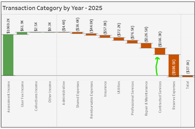
- The waterfall plot - showing each incremental income or expense and how it reflects in the total. For example, you can see in 2025 that before the reserve expenses, the budget was very positive.
- The focus on category interaction - clicking on one of the categories in the expenses breakdown or transaction by category visuals updates the other charts. Here you can see that the majority of the reserve expense in 2025 was for necessary brick work in the HOA.
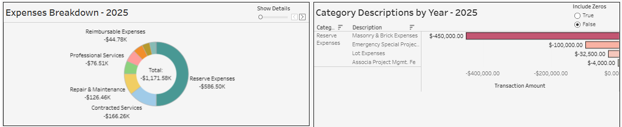
I say necessary because that’s what we were told. Something to the effect of “no brick work = no insurance = potential breach of mortage insurance agreement = potential foreclosure for all homeowners = very difficult to sell/qualify for buyer loan” Yeah.. a bit of catastrophizing - but definitely still worth paying attention too.
The pipeline end to end
That’s it! Now, to update the tableau dashboard with the following year’s information:
Data Entry -> New Field in GBQ -> Refresh Connected Sheet -> Refresh Tableau Source
Like what you see and don’t want to build it yourself?
This type of visual can help you quickly identify where money is being spent and lead to pinpointing massive savings at a fraction of the cost to create.
✅ I can build you a quote for developing a version tailored to your needs.
📩 Connect with me through email at hello@morescode-analytics.com.